Gift Gen

UX Design
Project Overview
This project was done as an assessment for my UX Design Professional Certificate from the National University of Singapore and was required to be completed in a day.
My Contributions
I am required to choose a problem from home to solve, evaluate an existing solution and suggest at least seven improvements based on usability goals and design principles.
Problem
One problem I face is that I often struggle to find an appropriate gift for a friend or a family member.

"How might we redesign the website such that it provides tailored gift recommendations based on individual preferences and interests, making the gift-giving experience more enjoyable and stress-free?"
Target Audience
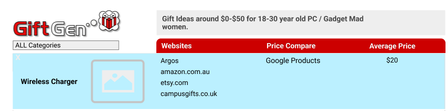
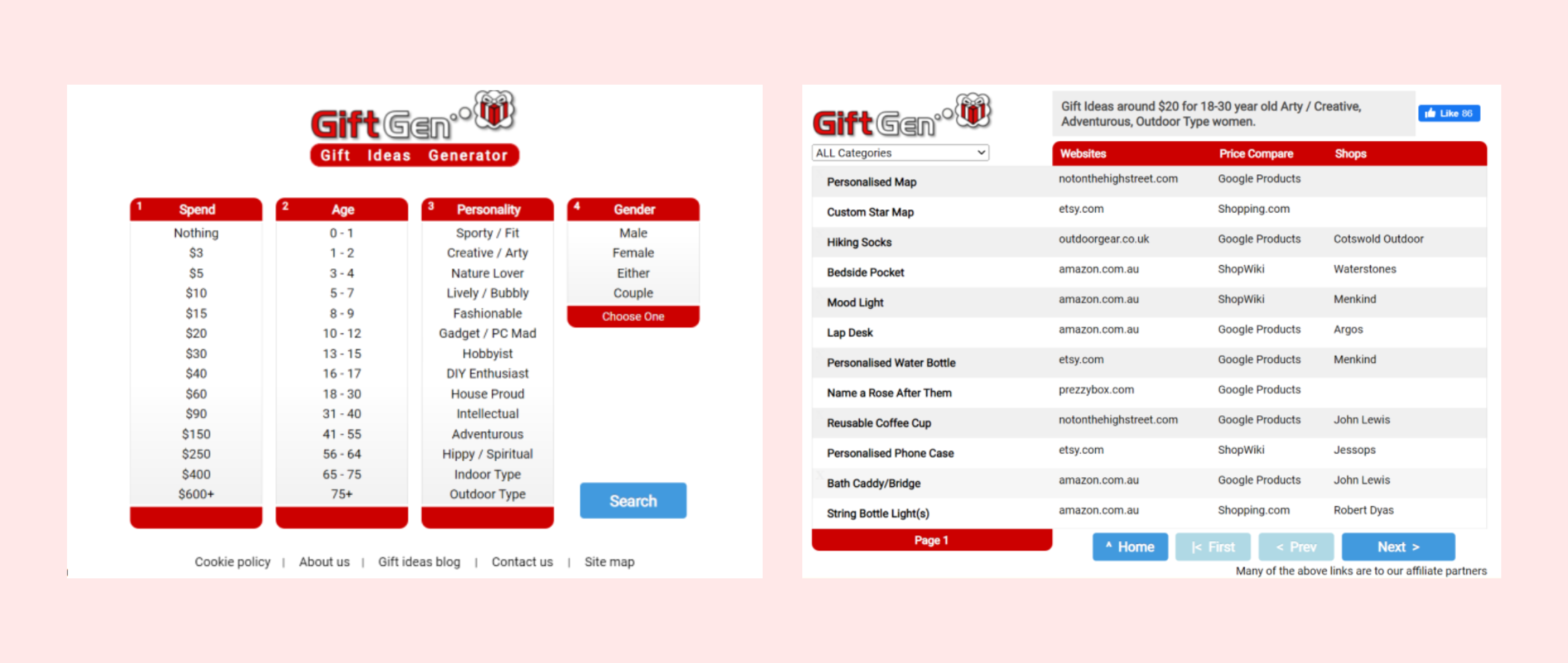
I came up with a user persona to better understand the motivations, needs, and shopping behaviors of gift givers, enabling me to design a user-friendly and intuitive gift selection platform that caters to their preferences and makes the gift-giving process more enjoyable and efficient.
Evaluating GiftGen website
The current Gift Gen website is shown in the picture below and I used the six usability goals to evaluate it.
Website Link
Usability Goal 1: Effectiveness
  • Straightforward search function with easy selection of variables
  • Variety of variables such as price, age, personality and gender
  • Provided many gift ideas and price comparison
  • Has a category filter to narrow down the search of the gifts
  • Using the word “Spend” may confuse users thinking whether it is minimum spend or maximum spend
Usability Goal 2: Efficiency
  • Easily search by selecting the variables of the gift receiver
  • Prices to choose from was an absolute value and the personality variables may not be comprehensive enough
  • Search results provide many website links and price comparison for each item which can cause users to spend more time choosing
  • “Websites” and “Shops” may cause confusion to user as shops is a subset of websites
Usability Goal 3: Learnability
  • Search categories and their respective fields are straightforward, seen at a glance
  • Unclear that multiple “Personality’’ variables can be selected
  • Search results do not provide a description or a picture of the product
  • Many external links to click just to get a look at the suggested product
Usability Goal 4: Safety
  • Options were given for each variable for the user to easily choose from (which provides limitation)
  • User can easily go back home with previous selections still intact to change or reset any of the variables
  • On top of the search results, it summarises the variables selected. This prevents people from forgetting what they have selected.
  • Has a category filter to narrow down the search of the gifts
  • Redirects user to a new tab when selecting a gift idea, this provides opportunities to still browse other suggestions.
Usability Goal 5: Memorability
  • Uses UX conventions of forms/navigation, familiar buttons to click such as ‘Search’ and ‘Next’ etc.
  • Easy to use with little arbitrary training
  • Page responds to clicks and changes colour when hovering
  • No usage of icons beside text labels
Usability Goal 6: Utility
  • Caters to different groups of gift receipients
  • Provides a efficient way of coming up with gift ideas
  • Gift suggestion may not be appropriate in terms of occasion
Proposed Improvement 1
Design Principle used: Visibility and Affordance
Provided a range of prices for users to choose instead of an absolute value for more flexibility. The price range bar also provides visual affordance that the bar can be dragged depending on the desired price range.

Proposed Improvement 2
Design Principle used: Affordance
Changing the selecting function with checkboxes provides visual affordance to user that they can choose more than one personality.

Proposed Improvement 3
Design Principle used: Visibility
Added "occasion" variable to provide user with more information to select suitable options.
Proposed Improvement 4
Design Principle used: Visibility
Increased the options of who the gift recipient is helps the user to make a better choice and search results
Proposed Improvement 5
Design Principle used: Constraint and Affordance
“Reset” button was added which is intuitive to the user that it is clickable and allows the user to reset if they made a mistake while selecting the variables.
Proposed Improvement 6
Design Principle used: Visibility
Picture of the gift idea is added so that users can visualize how the gift will look like when hovering.
Proposed Improvement 7
Design Principle used: Visibility
Adding average price provides more information to the user regarding the price of the gift.
Proposed Improvement 8
Design Principle used: Consistency
Changing the “^” symbol beside the home button to a home icon for a more familiar representation for the user.
Proposed Improvement 9
Design Principle used: Visibility
“Last” button was also added to make the navigation through different pages more comprehensive. It is also intuitive to users that the button can be clicked.
Reflection
This project has not only deepened my understanding of UX design principles and methodologies but also reinforced my passion for creating user-centered solutions. Successfully passing this assessment and earning my professional certificate gave me a sense of accomplishment. Moving forward, I am excited to apply the knowledge and experience gained from this project to future projects.